
The £500,000 dot

Why the best brand work is the part you never see.
"Half a million pounds to move a dot."
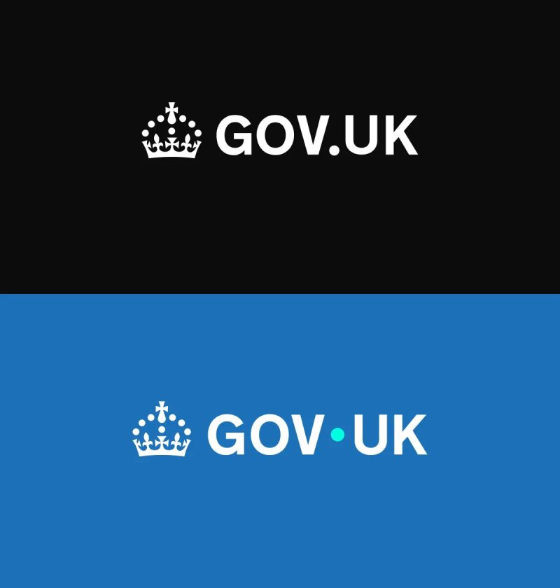
That was more or less the reaction when GOV.UK refreshed its brand back in June 2025. The visible change was small. The masthead went from black to blue, the little dot in the logo was nudged up and turned turquoise, and a crown appeared in the footer. The reported cost was somewhere around half a million pounds. You can see why people rolled their eyes.
And honestly, you can have a perfectly reasonable debate about whether public money should go on a brand refresh at all. That's a fair conversation. But it isn't the one I want to have here, because it skips over something more useful. The reaction told us a lot about how most of us understand what a brand actually is.
Because the dot was never the point.
What people were actually looking at
When you put the old logo next to the new one, the difference looks tiny. A colour here, a nudge there. If that's all you see, "why did that cost so much" is a completely logical question.
But that single side-by-side image is only the surface. Underneath it sat more than a year of work. A much wider colour palette. A design system built to hold together across the website, the app, the forms, the payment services and everything else that carries the GOV.UK name. All of it tested and retested with real people. The logo was simply the one piece small enough to fit in a screenshot and easy enough for everyone to have an opinion on.
GOV.UK isn't a marketing site. It's the front door to thousands of services, used by millions of people to do things that genuinely matter, from renewing a passport to registering a birth. Making all of that feel like one calm, consistent, trustworthy place is a serious piece of work. Most of it, by design, you never notice.
The logo is the 5% you can see
Here's the thing I wish more people understood about brand work.
The logo is the small visible tip of it. The other 95% is the thinking underneath. The strategy, the structure, the decisions about how everything fits together and stays consistent wherever someone bumps into you. That part rarely shows up in a side-by-side graphic. It shows up in the feeling you get when a business seems to have its act together.
Which is exactly why it gets undervalued. When brand work is done well, it looks effortless. And when something looks effortless, people assume it was easy. They see the dot, not the year of thinking that decided where the dot should go.
What this means if you run a smaller business
Most of my clients aren't rebranding thousands of services. But the same principle scales all the way down.
When you invest in your brand, the logo is not really what you're paying for. You're paying for someone to understand your business properly, work out what makes it different, and build something consistent enough that every part of it pulls in the same direction. The website, the words, the proposal, the way it all hangs together. That's the work. The logo is just the bit you can point at.
It also explains why the cheap, fast option so often disappoints. It usually delivers the visible 5% and quietly skips the rest. You get a logo. What you needed was a brand.
So the next time you see a refresh that looks like "not much changed," it's worth pausing before you judge it. Sometimes not much changed because not much thought went in. And sometimes it looks that way precisely because a great deal of thought went into making it look that simple.
If your own brand has started to feel like it's showing the visible 5% and hiding the good stuff underneath, that might be a sign it's time for your next chapter. No pressure and no hard sell. Just tell me a bit about where your business is headed, and we'll work out whether now's the right time.
Here's to your next chapter,
Kirsty


Comments